Simply Human: Simplifying Wellness for Modern Lives
The challenge
Make a growing range of wellness supplements easier to understand and choose in a category crowded with technical language and visually similar packaging.
The approach
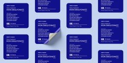
We created a clear, color-coded packaging system organized around recognizable needs and plain-language benefits. Each product remains part of one family while using distinct color and concise messaging to speed up navigation.
The result
A flexible identity and packaging system makes product selection more intuitive and presents wellness as straightforward, approachable, and human.