TŌGE — BRAND IDENTITY + PACKAGING
Tōge —
Making discovery feel at home in the condiment aisle.
Services —
→ Brand strategy
→ Visual identity
→ Packaging design
→ Art direction
Overview —
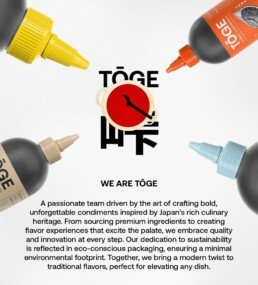
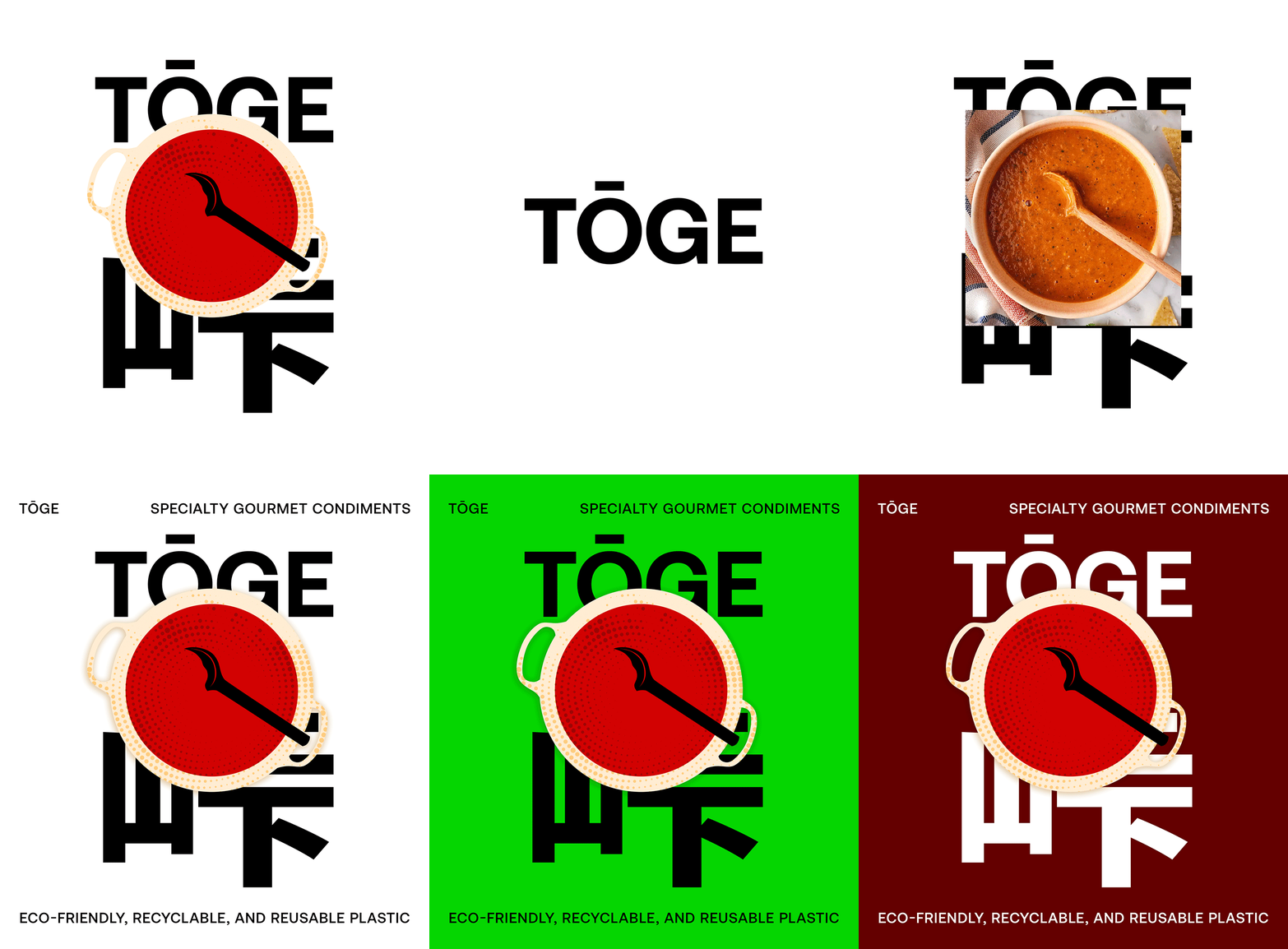
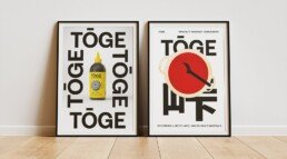
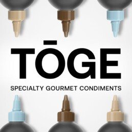
Tōge needed to interrupt a crowded aisle while supporting an expanding range of unexpected flavors. Its name—Japanese for “mountain pass”—became the organizing idea: movement, discovery, and changing terrain expressed through a bold mark, high-contrast color, and a packaging architecture that gives every flavor its own route.
The result is a system that becomes recognizable before it becomes predictable.
01
Interrupt
the category
02
Navigate
the range
03
Expand
with clarity
Building a brand that needs to stand out?
THE DESIGN LOGIC —
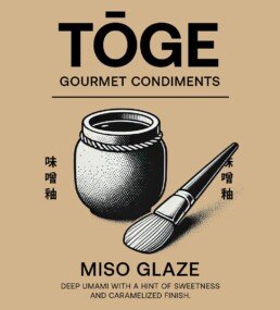
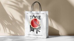
A fixed structural framework builds recognition. Shifting colors and compositions distinguish each flavor and keep the range energetic as it grows.