W — 001
Sprizzanté
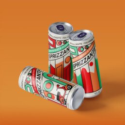
A contemporary aperitivo identity built to bring color, clarity, and occasion to the shelf.
SPRIZZANTÉ ITALIANA — BRAND IDENTITY + PACKAGING
Sprizzanté —
Turning the ritual of aperitivo into a bold contemporary brand system.
Services —
→ Brand strategy
→ Visual identity
→ Packaging design
→ Art direction
Overview —
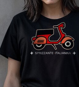
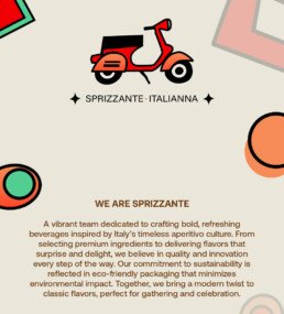
Sprizzanté needed the immediate recognition of an Italian aperitivo brand without falling into the category’s familiar decorative scripts. We built the identity around the feeling of the spritz: saturated citrus color, crisp typography, and an expressive system of shapes that brings effervescence and occasion to every touchpoint.
The result is a brand designed to be distinctive at distance, coherent across formats, and flexible enough to grow with the range.
01
Distinctive
at distance
02
Structured
for a range
03
Built around
occasion
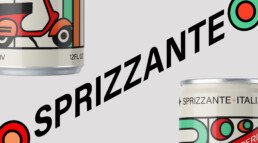


THE DESIGN LOGIC —
Color earns the first glance. Typography creates confidence. The supporting graphic language supplies movement and celebration—giving the brand a distinctive rhythm without losing clarity on shelf.